How to create a responsive navigation bar using HTML and CSS
Building a responsive navigation bar is an essential part of improving your user experience and web design skills. In this article, we’ll show you how to create a responsive navigation bar using only HTML and CSS (not even a single line of JavaScript!).
So if you are a newbie learning front-end development and looking to build a navigation bar, you’ve come to the right place. But, before we dive deeper, let’s start by understanding the basic design principles of a responsive navigation bar.
Prerequisite: the three key elements of a navigation bar
It’s pretty obvious that most website owners want to gain new visitors. The first step in doing this is showing visitors a clear and concise path. You are supposed to create a navigation bar that inspires curiosity and simultaneously draws in visitors. You should have three key elements when designing an ideal navigation bar:
Simple
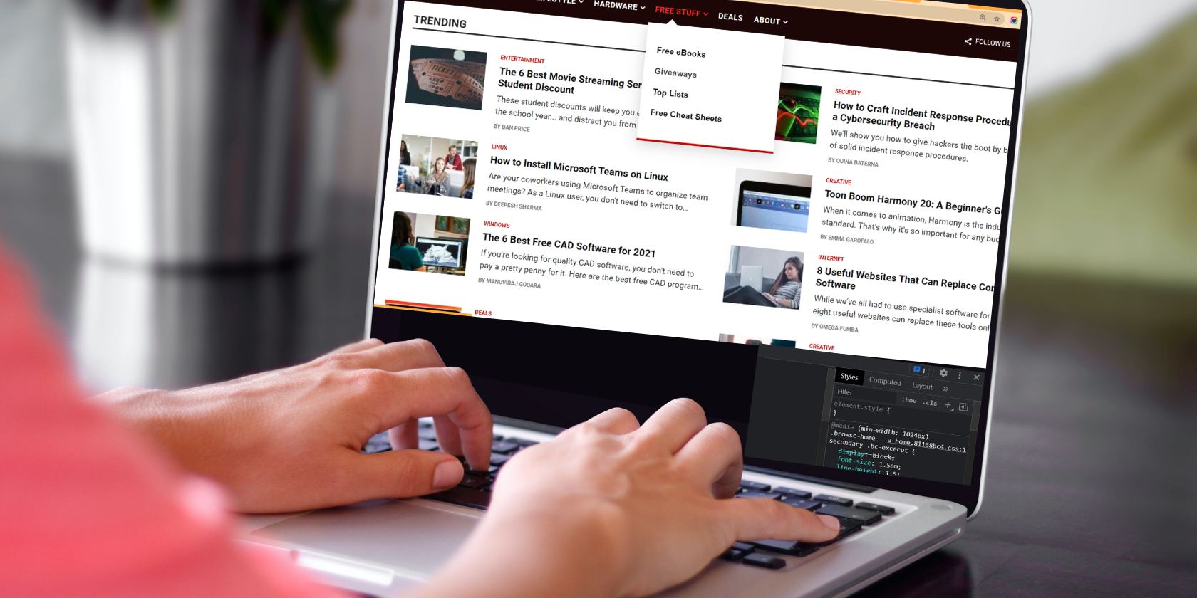
It should be clear and easy to read. Instead of cluttering up the navigation bar with links to each page, you should go for the broader categories of your site. Subsequently, you can add sub-menus as a drop-down list if necessary.
Perceptible
A simple navigation bar shouldn’t be boring at all. You have to stick to a predetermined brand color to make the design more cohesive. You can experiment with many color schemes and use lighter or darker shades for highlighting and dropdowns.
Sensitive
A Global Internet Use Report by Statista shows that 59.5% of the world’s population actively uses the Internet and 92.6% use it through mobile devices. This is more than enough to understand the importance of implementing responsive mobile navigation on your site.
High level mobile navigation is very popular. You can use hamburger menu, guillotine, floating icons, and tabs. It’s a savior when you have five or more categories with multiple hierarchies. High-level navigation can save a lot of screen space, especially when you have a content-rich site.
Tab bars with relevant icons work well for the bottom navigation bar as they typically contain three to five menus at the same hierarchy level. Sub-menus and sequential menus follow the main category with the parent-child relationship.
Now that the design principles are crystal clear in your mind, let’s start creating the menu. We’ll be creating a responsive navigation bar using CSS Flexbox and Media Queries from scratch.
So what will our navigation bar look like? It will have high level navigation with:
-
Logo
-
Navigation menus
-
Scrolling menu
-
Hamburger menu (using the checkbox hack)
Getting started with HTML
Document
We will have the drop-down menu inside the Service (Main menu. We can ignore the hamburger menu when creating the desktop navigation bar. After all, we haven’t discussed the checkbox workflow yet.
Go out:

Basic CSS application: utilities
/* UTILITIES */
* {
margin: 0;
padding: 0;
box-sizing: border-box;
}
body {
font-family: cursive;
}
a {
text-decoration: none;
}
li {
list-style: none;
}
Let’s go ahead, let’s style our navigation bar.
Style the navigation bar using CSS Flexbox
We’ll use CSS Flexbox and apply hover effects for highlighting. The Service the menu needs a little extra attention as you have to set display: none; for normal conditions and set it to visualization block; when someone walks over it.
/* NAVBAR STYLING STARTS */
.navbar {
display: flex;
align-items: center;
justify-content: space-between;
padding: 20px;
background-color: teal;
color: #fff;
}
.nav-links a {
color: #fff;
}
/* LOGO */
.logo {
font-size: 32px;
}
/* NAVBAR MENU */
.menu {
display: flex;
gap: 1em;
font-size: 18px;
}
.menu li:hover {
background-color: #4c9e9e;
border-radius: 5px;
transition: 0.3s ease;
}
.menu li {
padding: 5px 14px;
}
/* DROPDOWN MENU */
.services {
position: relative;
}
.dropdown {
background-color: rgb(1, 139, 139);
padding: 1em 0;
position: absolute; /*WITH RESPECT TO PARENT*/
display: none;
border-radius: 8px;
top: 35px;
}
.dropdown li + li {
margin-top: 10px;
}
.dropdown li {
padding: 0.5em 1em;
width: 8em;
text-align: center;
}
.dropdown li:hover {
background-color: #4c9e9e;
}
.services:hover .dropdown {
display: block;
}
Go out:

Responsive navigation bar using CSS media queries
As noted, we will have a hamburger menu that will only appear on mobile devices with a small screen size. For this we will have two children of
. First of all, we will use entry type = “checkbox” and give the label a class = “hamburger”. Second, we are going to give our navigation menu class = “menu”.
Note that ☰ is an HTML entity that displays the ?? (hamburger icon.)
The logic behind using the checkbox element is that when unchecked it will have display: none; whereas, although it is checked, it will modify the CSS property of the general sibling selector (~) by setting it to visualization block; Simply put, we’re using the checkbox to toggle the hamburger and navigation menus between expanded and hidden states.
Style the navigation bar for mobile devices using CSS media queries as shown below. In this case, you can also use CSS and JS grid for mobile menu.
/*RESPONSIVE NAVBAR MENU STARTS*/
/* CHECKBOX HACK */
input[type=checkbox]{
display: none;
}
/*HAMBURGER MENU*/
.hamburger {
display: none;
font-size: 24px;
user-select: none;
}
/* APPLYING MEDIA QUERIES */
@media (max-width: 768px) {
.menu {
display:none;
position: absolute;
background-color:teal;
right: 0;
left: 0;
text-align: center;
padding: 16px 0;
}
.menu li:hover {
display: inline-block;
background-color:#4c9e9e;
transition: 0.3s ease;
}
.menu li + li {
margin-top: 12px;
}
input[type=checkbox]:checked ~ .menu{
display: block;
}
.hamburger {
display: block;
}
.dropdown {
left: 50%;
top: 30px;
transform: translateX(35%);
}
.dropdown li:hover {
background-color: #4c9e9e;
}
}
Here is what we have built:
Office

Mobile devices

Experimenting is the best way to design your ideal navigation bar.
Having good website navigation has a huge impact on bounce rates and conversion rates. Essentially, the first part of your website should have clear context, hierarchical navigation, and a call to action. Your website’s navigation structure should help visitors get to popular or trending pages on your site in three clicks or less. So, keep experimenting and designing better site navigation!

Read more
About the Author