5 neumorphic design components in HTML, CSS and JavaScript
Neumorphism is a new design trend that combines flat design and skeuomorphism. It’s a minimal way of designing with soft extruded plastic, almost 3D style. Currently, this design is all the rage on the Internet and is widely used by designers and developers.
If you want to try neumorphism for your next project, here are some code snippets to get you started.
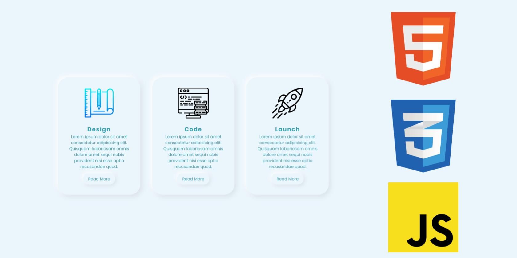
1. Neumorphic Cards

Use the following HTML and CSS snippets to create the above neumorphic maps.
HTML code
Neumorphic Cards


Design
Lorem ipsum dolor sit amet consectetur adipisicing elit. Quisquam laboriosam omnis dolore amet sequi nobis provident nisi esse optio recusandae quod.
Read More


Code
Lorem ipsum dolor sit amet consectetur adipisicing elit. Quisquam laboriosam omnis dolore amet sequi nobis provident nisi esse optio recusandae quod.
Read More


Launch
Lorem ipsum dolor sit amet consectetur adipisicing elit. Quisquam laboriosam omnis dolore amet sequi nobis provident nisi esse optio recusandae quod.
Read More
CSS code
@import url('https://fonts.googleapis.com/css?family=Poppins:400,500,600,700,800,900&display=swap');
*
{
margin: 0;
padding: 0;
box-sizing: border-box;
font-family: 'Poppins', sans-serif;
}
body
{
display: flex;
justify-content: center;
align-items: center;
min-height: 100vh;
background: #ebf5fc;
}
.container
{
position: relative;
display: flex;
justify-content: space-around;
align-items: center;
flex-wrap: wrap;
width: 1100px;
}
.container .card
{
width: 320px;
margin: 20px;
padding: 40px 30px;
background: #ebf5fc;
border-radius: 40px;
box-shadow: -6px -6px 20px rgba(255,255,255,1), 6px 6px 20px rgba(0,0,0,0.1);
}
.container .card:hover
{
box-shadow: inset -6px -6px 20px rgba(255,255,255,0.5), inset 6px 6px 20px rgba(0,0,0,0.05);
}
.container .card .imgBx
{
position: relative;
text-align: center;
}
.container .card .imgBx img
{
max-width: 120px;
}
.container .card .contentBx
{
position: relative;
margin-top: 20px;
text-align: center;
}
.container .card .contentBx h2
{
color: #32a3b1;
font-weight: 700;
font-size: 1.4em;
letter-spacing: 2px;
}
.container .card .contentBx p
{
color: #32a3b1;
}
.container .card .contentBx a
{
display: inline-block;
padding: 10px 20px;
margin-top: 15px;
border-radius: 40px;
color: #32a3b1;
font-size: 16px;
text-decoration: none;
box-shadow: -4px -4px 15px rgba(255,255,255,1), 4px 4px 15px rgba(0,0,0,0.1);
}
.container .card .contentBx a:hover
{
box-shadow: inset -4px -4px 10px rgba(255,255,255,0.5), inset 4px 4px 10px rgba(0,0,0,0.1);
}
.container .card a:hover span
{
display: block;
transform: scale(0.98);
}
.container .card:hover .imgBx,
.container .card:hover .contentBx
{
transform: scale(0.98);
}
2. Neumorphic form

Use the following HTML and CSS snippets to create the above neumorphic shape.
HTML code
Neumorphic Form
CSS code
body, html {
background-color: #EBECF0;
}
body, p, input, select, textarea, button {
font-family: "Montserrat", sans-serif;
letter-spacing: -0.2px;
font-size: 16px;
}
div, p {
color: #BABECC;
text-shadow: 1px 1px 1px #FFF;
}
form {
padding: 16px;
width: 320px;
margin: 0 auto;
}
.segment {
padding: 32px 0;
text-align: center;
}
button, input {
border: 0;
outline: 0;
font-size: 16px;
border-radius: 320px;
padding: 16px;
background-color: #EBECF0;
text-shadow: 1px 1px 0 #FFF;
}
label {
display: block;
margin-bottom: 24px;
width: 100%;
}
input {
margin-right: 8px;
box-shadow: inset 2px 2px 5px #BABECC, inset -5px -5px 10px #FFF;
width: 100%;
box-sizing: border-box;
transition: all 0.2s ease-in-out;
appearance: none;
-webkit-appearance: none;
}
input:focus {
box-shadow: inset 1px 1px 2px #BABECC, inset -1px -1px 2px #FFF;
}
button {
color: #61677C;
font-weight: bold;
box-shadow: -5px -5px 20px #FFF, 5px 5px 20px #BABECC;
transition: all 0.2s ease-in-out;
cursor: pointer;
font-weight: 600;
}
button:hover {
box-shadow: -2px -2px 5px #FFF, 2px 2px 5px #BABECC;
}
button:active {
box-shadow: inset 1px 1px 2px #BABECC, inset -1px -1px 2px #FFF;
}
button .icon {
margin-right: 8px;
}
button.unit {
border-radius: 8px;
line-height: 0;
width: 48px;
height: 48px;
display: inline-flex;
justify-content: center;
align-items: center;
margin: 0 8px;
font-size: 19.2px;
}
button.unit .icon {
margin-right: 0;
}
button.red {
display: block;
width: 100%;
color: #AE1100;
}
.input-group {
display: flex;
align-items: center;
justify-content: flex-start;
}
.input-group label {
margin: 0;
flex: 1;
}
3. Neumorphic navigation bar

Use the following HTML, CSS, and JavaScript snippets to create the above neumorphic navigation bar.
HTML code
Neumorphic Navbar
CSS code
* {
margin: 0;
padding: 0;
box-sizing: border-box;
}
body {
background-color: #efeeee;
}
.nav {
width: 100vw;
height: 100px;
background-color: #efeeee;
box-shadow: 10px 10px 12px 0 rgba(0, 0, 0, 0.07);
border-radius: 0 0 10px 10px;
display: flex;
justify-content: flex-end;
align-items: center;
padding: 0 3rem;
list-style-type: none;
}
.nav li.logo {
margin-right: auto;
font-family: "Roboto", sans-serif;
font-size: 1.5rem;
color: dimgray;
font-weight: 900;
text-shadow: 2px 2px 4px rgba(0, 0, 0, 0.3), -2px -2px 4px white;
}
.nav li:not(.logo) {
margin: 0 1rem;
padding: 0.5rem 1.5rem;
border: 2px solid rgba(255, 255, 255, 0.3);
box-shadow: 4px 4px 6px 0 rgba(0, 0, 0, 0.1), -4px -4px 6px white;
border-radius: 10px;
font-family: "Roboto", sans-serif;
cursor: pointer;
transition: color 0.2s ease-out, transform 0.2s ease-out;
color: dimgray;
}
.nav li:not(.logo):hover {
transform: scale(1.05);
box-shadow: 4px 4px 10px 0 rgba(0, 0, 0, 0.1), -4px -4px 10px white;
}
.nav li:not(.logo):focus {
outline: none;
transform: scale(0.95);
box-shadow: 4px 4px 10px 0 rgba(0, 0, 0, 0.1), -4px -4px 10px white, 4px 4px 10px 0 rgba(0, 0, 0, 0.1) inset, -4px -4px 10px white inset;
}
.nav li:not(.logo):hover, .nav li:not(.logo):focus {
color: orangered;
}
JavaScript code
feather.replace();4. Text and neumorphic forms

Use the following HTML and CSS snippets to create the above text and neumorphic shapes.
HTML code
Neumorphic Text and Shapes


Circle
Donut
Square
Smooth Square
Tumbler
Neumorphic Text
Welcome to MUO
CSS code
*, *::before, *::after {
box-sizing: border-box;
}
:root {
--nColor: #aaa;
--brShadow: -6px 6px 10px rgba(0,0,0,0.5);
--tlShadow: 6px -6px 10px rgba(255,255,255,0.5);
}
body {
margin: 0;
font-family: sans-serif;
min-height: 100vh;
display: flex;
align-items: center;
justify-content: center;
flex-wrap: wrap;
background: var(--nColor);
}
.n-outset,
.n-inset {
display: flex;
align-items: center;
justify-content: center;
}
.n-circle {
background-color: var(--nColor);
box-shadow: var(--brShadow), var(--tlShadow);
border-radius: 50%;
width: 200px;
height: 200px;
margin: 10px;
}
.n-donut {
background-color: var(--nColor);
box-shadow: var(--brShadow), var(--tlShadow);
border-radius: 50%;
width: 200px;
height: 200px;
margin: 10px;
}
.n-donut .n-inset {
background-color: var(--nColor);
box-shadow: inset var(--brShadow), inset var(--tlShadow);
border-radius: 50%;
width: 50%;
height: 50%;
margin: 0;
}
.n-tumbler {
background-color: var(--nColor);
box-shadow: var(--brShadow), var(--tlShadow);
border-radius: 50%;
width: 200px;
height: 200px;
margin: 10px;
}
.n-tumbler .n-outset {
background-color: var(--nColor);
box-shadow: var(--brShadow), var(--tlShadow);
border-radius: 50%;
width: 80%;
height: 80%;
margin: 0;
}
.n-square {
background-color: var(--nColor);
box-shadow: var(--brShadow), var(--tlShadow);
border-radius: 0;
width: 200px;
height: 200px;
margin: 10px;
}
.n-smooth-sq {
background-color: var(--nColor);
box-shadow: var(--brShadow), var(--tlShadow);
border-radius: 10%;
width: 200px;
height: 200px;
margin: 10px;
}
.n-text {
color: var(--nColor);
text-shadow: var(--brShadow), var(--tlShadow);
font-size: 6em;
font-weight: bold;
}
5. Neumorphic buttons

Use the following HTML, CSS, and JavaScript snippets to create the above neumorphic buttons.
HTML code
Neumorphic Buttons
Press the buttons
CSS code
@import url('https://fonts.googleapis.com/icon?family=Material+Icons');
body{
background-color: #6ec7ff;
}
.btn-holder{
display: block;
margin: 0 auto;
margin-top: 64px;
text-align: center;
}
.intro-text{
margin-bottom: 48px;
font-family: 'Quicksand', sans-serif;
color: white;
font-size: 18px;
}
.btn{
width: 110px;
height: 110px;
font-size: 30px;
border-radius: 30px;
border: none;
color: white;
vertical-align: top;
-webkit-transition: .6s ease-in-out;
transition: .6s ease-in-out;
}
.btn:hover{
cursor: pointer;
}
.btn:focus{
outline: none;
}.btn:first-of-type{
margin-right: 30px;
}
.neumorphic{
background: linear-gradient(145deg, #76d5ff, #63b3e6);
box-shadow: 30px 30px 40px #1e7689,
-30px -30px 40px #7fe5ff;
border: 3px solid rgba(255, 255, 255, .4);
}
.neumorphic-pressed{
background: linear-gradient(145deg, #63b3e6, #76d5ff);
-webkit-box-shadow: inset 15px 15px 20px -20px rgba(0,0,0,.5);
-moz-box-shadow: inset 15px 15px 20px -20px rgba(0,0,0,.5);
box-shadow: inset 15px 15px 20px -20px rgba(0,0,0,.5);
}
.neumorphic:focus, .neumorphic:hover, .neumorphic:focus, .neumorphic:hover, .neumorphic-pressed:focus, .neumorphic-pressed:hover {
border: 3px solid rgba(46, 74, 112, .75);
}
.material-icon {
font-family: 'Material Icons';
font-weight: normal;
font-style: normal;
font-size: 32px;
display: inline-block;
line-height: 1;
text-transform: none;
letter-spacing: normal;
word-wrap: normal;
white-space: nowrap;
direction: ltr;
-webkit-font-smoothing: antialiased;
text-rendering: optimizeLegibility;
-moz-osx-font-smoothing: grayscale;
font-feature-settings: 'liga';
}
#pause {
color: #143664;
display: none;
}
JavaScript code
function changeStyle(btnPressed) {
var btn = document.getElementById(btnPressed);
btn.classList.toggle("neumorphic");
btn.classList.toggle("neumorphic-pressed");
if (btnPressed === 'play-pause') {
play();
} else if (btnPressed === 'shuffle-btn') {
shuffle();
}
}
function play() {
var playBtn = document.getElementById('play');
var pauseBtn = document.getElementById('pause');
if (playBtn.style.display === 'none') {
playBtn.style.display = 'block';
pauseBtn.style.display = 'none';
} else {
playBtn.style.display = 'none';
pauseBtn.style.display = 'block';
}
}
function shuffle() {
var shuffleBtn = document.getElementById('shuffle-btn');
if (shuffleBtn.style.color == 'white' || shuffleBtn.style.color == '') {
shuffleBtn.style.color="#143664";
} else {
shuffleBtn.style.color="white";
}
}
If you’d like to check out the full source code used in this article, here’s the GitHub repository.
To note: The code used in this article is licensed under the MIT license.
Style your website with neumorphism
You can use the minimalist design concept of neumorphism to style your website. It offers an aesthetic appearance. But still, neumorphism has accessibility limitations.
There are different ways to make a website look stylish. If you want to style bland boxes on your website, try the CSS box-shadow property.

Read more
About the Author